This is basic chart spinning. The values on the left (temperature) and right (CO2 emissions) have no correlation. This is basically two different charts that are overlaid and don’t correspond to anything in relation to each other (other tan dates).
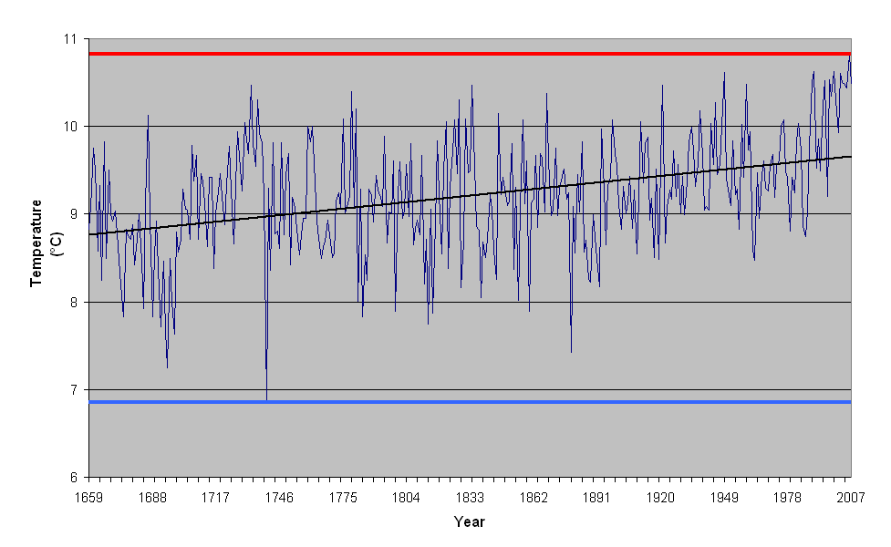
The Min and Max values for temperature are 6.84 and 10.82. But for the graph, they use 4 and 18. And the 6.84 is a single anomaly. Other than that, all of the temperatures are between 7 and 11. Then the zero point CO2 emissions are set arbitrarily at 4 degrees. For no reason. And extended up to 18 degrees, for no reason.
Changing the left and right ranges is an easy way to make graphs display whatever you want. Imaging if the right-side CO2 emissions range staid the same, but the range for the temperature was changed to 0-100, or even 0-1000. The line for CO2 would not change, but the temperature would be essentially a solid straight line.
In evaluating such a graph, you have to question those ranges and why they are being used. In this case, there is no reason to use 4 to 18 for the temperature. It should be 6 to 11, or probably 7 to 11. So you should suspect propaganda right away.
The other issue is where the line for CO2 emissions is placed. There is a long period of zero emissions. If you want to correlate emissions to temperature, it should be at an average temperature during the time of zero emissions, not arbitrarily placed equivalent to several degrees below any temperature that has ever happened.
I got the temperature data from the web site listed as the source on the chart. I got CO2 emissions data from
http://www.mr-riordan.com/apes/handouts/week10/molnar24.html. This charts the same as what is in the chart, but is different units.
So, here is the real picture:

The scratchy blue lines are yearly average temperatures. The dark black is an 11 year average (including 5 years before and after). The green line represents the average temperature from 1660 to 1946 (when the big CO2 emissions started). The range is based on the yearly average temperatures, 7 to 11 (with only one year dropping slightly below that range).
The think dark red line (that you can hardly see) is the average yearly CO2 emissions. The bold red line is the 11 year average. These lines are postioned to so that the zero years correspond to the average temperature during the zero years (more or less: 1660 to 1946 ). The big problem is where to set the maximum for the CO2 emissions line. It could be set smaller or larger based on any number of criteria. I chose to set it so that the maximum CO2 emission equals the maximum temperature. Probably not a good method for a realistic percentage comparison, but I think it works well for identifying correlation.
This is the real graph of the data for purposes of identifying correlation. Make of it what you will.

") .
.